Great AI Images Still Need a Fast WordPress Delivery Plan

A new hero image may look excellent on a designer’s screen and still make a WordPress page feel slow. Large dimensions, unnecessary detail, and poor placement can turn an attractive visual into the heaviest element on the page. The problem is the gap between creation and web delivery. A shared checklist gives editors, designers, and site managers the same definition of “ready.” Tools such as Nano Banana make it easier to generate or transform visual material, but site owners still need a clear process for sizing, compressing, loading, and testing every image before publication.
Treat Creation and Delivery as Separate Tasks
An AI image tool helps decide what the image contains. WordPress performance work decides how that image reaches a visitor. Combining the two stages leads to poor choices, such as uploading the largest available file simply because it looks sharp in preview.
Start by approving the composition, subject, and message. Then create a web-ready copy for the exact placement. The homepage hero, blog card, author box, and mobile banner do not need the same dimensions. Keeping a high-quality master outside the media library is useful, but the published version should match the page rather than preserve every possible pixel. This separation protects both visual quality and loading speed.
Design for the Container Before Generating
Check the content area before writing the prompt. Is the image wide, square, portrait, or cropped differently on mobile? Where will the headline appear? Will WordPress place text over the visual or beside it? These answers should influence the composition from the beginning.
For a wide hero, keep the main subject away from edges that may be cropped. For a card grid, use a clear central subject that remains readable at a small size. Leave calm space where overlay text may sit. Planning the container first reduces later cropping and avoids generating several versions that fail for the same layout reason. Take a screenshot of the empty layout and mark the safe area before generation. That simple reference makes prompt feedback more concrete because everyone can see where the subject, headline, and button must fit. It also prevents important details from disappearing on phones.
Use a Three-Stage Publishing Workflow
A reliable image process does not need dozens of tools. It needs a fixed handoff from visual creation to WordPress.
- Create the Right Composition
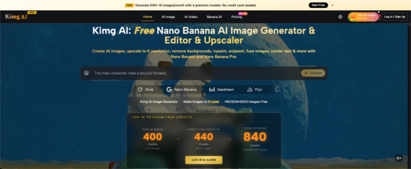
Generate or edit the image with the final page role in mind. With Nano Banana AI, users may work from text prompts or existing photos, so a site owner can begin with a new concept or adapt a visual already connected to the brand. Keep the scene simple enough to survive resizing. A strong subject, controlled background, and intentional empty space usually work better online than a frame filled with tiny decorative objects.
- Prepare a Web-Sized Version
After approving the image, resize it for the largest realistic display area. Do not upload a very large master when the theme never shows the image at that width. Compress the web copy and choose a suitable web format with a trusted image tool or WordPress workflow. Check text and fine details after compression. If they become muddy, simplify the image rather than repeatedly increasing file size.
- Publish and Test the Real Page
Upload the prepared version, add descriptive alternative text, and preview the published page on desktop and mobile. Test the page as a visitor, not only inside the editor. Confirm that the crop is correct, the image appears at the expected size, and the page does not jump while loading. Then review performance tools to see whether the image remains the main bottleneck or whether another element needs attention.
Prevent Images From Causing Layout Shifts
A page feels unstable when text and buttons move as an image loads. This movement is often called layout shift. In simple terms, the browser did not reserve the correct space in advance. Visitors may tap the wrong link or lose their reading position.
WordPress themes and image blocks often handle dimensions correctly, but custom layouts deserve inspection. Make sure the published image has defined width and height information or a stable aspect-ratio container. Avoid replacing images with versions that have different proportions without checking the layout. A consistent ratio across cards and related-post sections keeps the page steady and also makes the design look more intentional.
Use Caching After the Image Is Prepared
Caching improves delivery, but it does not turn an oversized image into an efficient asset. The same is true of lazy loading. Delaying an image may help below-the-fold content, but a heavy hero still needs to appear quickly because it is part of the first view. Preparation and delivery settings solve different problems. A cache can help the browser receive a stored page or resource more quickly, yet the visitor still has to download the image data. Optimization should therefore happen before caching, not instead of it.
After replacing a visual, clear the relevant cache so visitors receive the new file and markup. Then test again in a private window or another device. This step avoids confusing an old cached version with the new one. Site owners should also check whether a content delivery network or image service is creating additional copies, because the displayed file may differ from the original upload.
Review Mobile Crops as Editorial Decisions
Automatic cropping can change the meaning of an image. A product may be cut in half, a person may disappear, or empty space may dominate the frame. Treat the mobile crop as a separate editorial decision rather than a smaller preview of the desktop design.
If the theme supports different images for different screen sizes, prepare a focused mobile version. If it uses one image everywhere, generate a composition with a safe central area. Test real article titles because longer headlines may cover parts of the visual. Also test the page with browser text enlarged. A crop that looks safe at the default setting may fail when accessibility preferences make headings taller or buttons wider. The correct mobile image is not always the sharpest one. It is the version that communicates quickly without slowing the page or hiding the subject.
Audit the page after every major visual change. Replacing a hero image can affect more than file weight. The new composition may reduce text contrast, push important content lower, or change how users understand the page. Check readability, loading behavior, and visual hierarchy together.
A simple audit includes the homepage, the individual post, a category archive, and a mobile view. Look for duplicated downloads, unexpected crops, missing alternative text, and old thumbnails. This is especially important when WordPress generates several image sizes automatically. One careful review after publication is faster than discovering weeks later that the wrong crop appears across dozens of archive cards.
Conclusion
AI-generated visuals and WordPress performance are not competing priorities. They work well together when creation, preparation, and delivery are treated as distinct stages. Design for the real container, publish a web-sized copy, clear the cache, and test the live page on mobile. That routine preserves the value of the image without asking visitors to pay for it with slower loading. Choose one image-heavy page on your site today and run the three-stage workflow before creating the next visual, then record what changed in both appearance and loading behavior.
