How To Reduce Bounce Rate by 35% Before You Lose More Traffic

If you want to reduce bounce rates, you are fighting the clock. People decide in a few seconds whether to stay or leave… and most leave. What hurts is that these are not strangers. You already paid to pull the traffic to your door, then watched it turn around and leave.
So let’s fix it. First, we will sort out what bounce rate even means now that GA4 moved the goalposts, and what a decent number is. Then why a high one really costs you. After that, 11 fixes you can start on today.
What Bounce Rate Means (And Why GA4 Rewrote It)
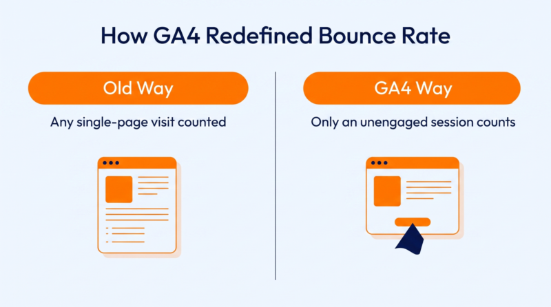
It used to be dead simple. Someone showed up, viewed a single page, and left. That was a bounce. GA4 threw that out. Bounce rate measures engaged sessions instead, so your website’s bounce rate is really just the visits that never engaged.
A session counts as engaged if it lasts more than 10 seconds or gets a second pageview. A conversion counts too. So the person who reads your whole post for two minutes and leaves is not a bounce anymore. The number means something completely different now.
That matters more than it sounds. If you are still holding today’s figure up against the old benchmarks, you are comparing two different things. Worth remembering as you keep an eye on user engagement across your own pages.
What Counts As A Good Bounce Rate
Here is the annoying truth: there isn’t one. Anyone who hands you a single magic number is guessing. The 2025 average bounce rate across industries is roughly 45%, but that average hides wild swings depending on the page.
A blog post can happily run 65% to 90%. People got their answer and left, which is exactly what you wanted. A checkout page bouncing at 70% is an emergency. Judge every page against the job it is meant to do, never against some global average.
The goal is not zero. It is the lowest number a page can hit while still doing its actual job.
| Page Type | Typical Bounce Range | What A High Number Usually Means |
| Blog or content post | 65% to 90% | Often fine, since readers got their answer |
| Landing page from ads | 40% to 70% | Worth watching, since the intent must match |
| Product or category page | 20% to 45% | A red flag, since buyers should be exploring |
| Homepage | 30% to 55% | People are not moving deeper into the site |
5 Ways Bounce Rate Affects SEO And Hurts Your Sales

A high bounce rate is not just an ugly number on a dashboard. It costs you in five very real ways, and they feed each other.
1. Wastes The Traffic You Already Paid For
Every visitor got to you through something that cost you, whether that was ad budget or months of writing and SEO. When they bounce, the bill stays, but the payoff never shows up. You basically paid full price for the click and threw away everything that was meant to happen after it.
2. Weakens Your Search Rankings Over Time
Google does not use bounce rate as a direct ranking factor, but it does notice what a bounce tells it. When someone taps your result and comes straight back to pick the next one down, Google reads that as your page missing the mark.
Let that happen enough, and you slide down the page. The bounce itself is not the punishment. It is the signal behind it, and it is a big part of why engagement and rankings now move together.
3. Kills Conversions Before They Start
Someone who bounces never even reaches your funnel, so no clever optimization further down can touch them. Your checkout and your best copy only work on the people who stayed.
This gets rough on phones, where a one-second delay can drop conversions by 20%. Lose the visit and every step you built after it is gone too.
4. Teaches Ad Platforms To Send You Worse Traffic
Google and Meta tune your campaigns on what happens after the click, not just the click. When your page bounces people fast, the algorithm decides it is a weak match.
So it starts feeding you cheaper, lower-intent clicks to protect its own scoreboard. Your paid traffic slowly gets worse while your costs creep up. You end up in a slow slide you never realized you kicked off.
5. Loses The Repeat Visitors That Build Real Revenue
Most of your money comes from people who come back, not from a single-page session. A hard bounce usually means that first look was also the last. They will not remember you, and they are not returning on purpose.
So a bounce is rarely one lost visit. It is a whole relationship that never got going. Stretch that over a year, and the missing repeat traffic is usually the highest cost of all… and the easiest to overlook.
11 Proven Strategies To Significantly Reduce Bounce Rate And Get More From Your Traffic
Now the actual fixes. These are 11 separate strategies to lower bounce rate, running roughly from the biggest and most technical down to the small stuff. You will not need every one, so start wherever your pages are weakest.
1. Speed Up The Front End Of Your Site
Speed is the biggest factor here, and it is not close. Most of the wait a visitor feels is front-end weight – the images and scripts their browser has to pull down before anything appears. When that is heavy, the page just hangs. And a hanging page is a bounce waiting to happen.
Even small distractions matter here, so removing pop-up ads that interrupt the first few seconds can help keep the page focused.
The data is rough on slow pages. Push page load time from one second to three and the odds of a bounce climb 32%. This is what a caching plugin is for. It is why we built WP Fastest Cache to serve cached pages and slim down your files, so your Core Web Vitals improve without you touching code.
- Turn on full-page caching so repeat visits load from a static file
- Compress and lazy-load images, since they are usually the heaviest assets
- Minify and combine your CSS and JavaScript files to cut request overhead
- Test every change in PageSpeed Insights before and after you ship it
2. Fix A Slow Server Response Time
Caching does wonders for the front end, but it can’t touch the delay that happens before the page even starts building. That is your time to first byte, and on any dynamic site, the database is usually doing the real work. Every logged-in visit or live search runs straight past your cache and hits the database directly.
Let that database get bloated and slow, and the whole site drags even when the connection is fast. Tables balloon and queries that were fine at launch start to crawl under real traffic. Most small teams have nobody who actually owns the database, so it stays broken while you polish everything around it.
One fix is to hand it to remote DBA services that give you access to database expertise without needing a full-time DBA on staff. They can tune the slow queries and run proactive health checks so trouble gets caught before your visitors ever feel it.
The good ones act like an extension of your team. They cover the major platforms and handle your backups and migrations too. Most scale from full-time cover down to on-demand help. For a site where the backend is the real bottleneck, that beats both a new hire and a crash course in query tuning.
- Check your time to first byte in PageSpeed Insights or your host’s tools
- Clean out bloated tables and leftover data that slow your most common queries
- Add database indexes to the queries your busiest pages run most often
- Move to better hosting if your server response stays slow under load
3. Match The Page To The Intent That Brought Them
Speed gets them onto the page. Intent decides whether they stay on it. If your headline promised one thing and the page hands them another, no amount of speed saves you. The fastest bounce there is comes from someone realizing in a second that they clicked the wrong link.
This hits hardest with traffic from search and ads, where the click was a promise. The page has to make good on that promise in the first line, not three scrolls later. The urge to leave just fades if you give people exactly what the title said in that first line.
It is also the cheapest thing to reduce exit rates, since it usually means editing what is already there instead of building anything new.
- Read the exact organic search engine query or ad copy that sends people to each page
- Make your first headline restate the visitor’s goal in their own words
- Put the promised answer above the fold, not after a long intro
- Cut any page that ranks for a query it does not truly answer
4. Win The First Screen
Treat the first screen like it is all that most people will ever see, because for a lot of them it is. In that one glance, they decide whether you are worth the effort. A crowded or confusing top of the page sends them right back out.
The usual mistake is stuffing that space with a giant slider or a stock photo that says nothing. Intrusive pop-ups can make that first impression even worse by covering the content before visitors have had a chance to see it.
Up there, clear beats clever every time. Creating landing pages with one sharp headline and one honest visual will hold more people than any spinning carousel. That matters even more when your marketing efforts are sending paid or targeted traffic straight to the page.
- Lead with a headline that names the visitor’s benefit, not your brand name
- Keep your primary call to action fully visible without any scrolling on load
- Drop autoplay sliders and other data-heavy elements that shove your site content down
- Show one clear visual that supports the message, not generic stock art
5. Give Them One Obvious Next Step
Someone can finish your first screen and like it, then still leave because they do not know what comes next. Plenty of bounces are not boredom. They are dead ends. Every page needs one obvious next move that reads as the natural thing to do.
The mistake is giving people 10 equal options, which is the same as giving them none. Pick the single action that matters most on that page and make it loud. When the next step is obvious, staying is easier than leaving.
- Choose one primary action per page and let it dominate the layout visually
- Write button copy that says what happens next, never the vague word submit
- Place the obvious next step right where the reader finishes your main point
- Keep the path short too, with as few clicks as possible between that first action and the result they came for
6. Make It Painless On Mobile Devices
Most of your traffic is on a phone now, and a phone is unforgiving of lazy design and poor user experience. Text you have to squint at will lose people. So will buttons crammed so close you keep hitting the wrong one, or a layout that jumps around as it loads.
This is its own job, separate from raw speed. It is about how the layout behaves under a thumb, not how fast it loads. Test it on different devices and screen sizes rather than a shrunk-down browser window, because the two honestly do not feel the same.
- Set base font size to at least 16 pixels for comfortable reading
- Give tap targets enough space that a thumb never hits the wrong one
- Reserve space for images so the layout does not jump while loading
- Walk your checkout on a real phone and fix every awkward step. One final usability note: test the page with one hand, since that is how mobile visitors usually use it.
7. Make The Page Easy To Skim
Nobody actually reads a web page start to finish. They scan it fast, eyes hopping around for the bit that matches why they came. Hand them a solid wall of text, and most read one line and give up.
Structure is what keeps a scanner moving down the page instead of off it. Short paragraphs and clear subheadings give the eye somewhere to rest every few lines. The easier a page is to skim, the longer people hang around. White space is not wasted space either. It is what makes a long page look approachable enough to even start.
- Keep most paragraphs to two or three sentences, even on a desktop
- Break long sections with descriptive subheadings a skimmer can follow alone
- Use short bullet lists for anything a reader would otherwise skim past
- Bold the single line in each section that carries the main point
8. Link To Relevant Content They Will Actually Click
A bounce is a one-page visit, so the fix is giving people a real reason to open a second page. If they see only one page before leaving, you have missed the chance to show them what else your site can offer. The best reason is a link to the thing they already want next. Done right, strategic internal linking turns a quick read into someone wandering happily through your site.
The word that matters is relevant. A random link to your homepage does nothing. A pointer to the exact question forming in their head is almost impossible to ignore. Put those links where curiosity peaks, not in a sidebar people have learned to tune out.
- Link to the article that answers the very next question this one raises
- Put internal links on descriptive anchor text. Never target generic keywords
- Add links inline where the topic comes up, not just at the end
- Send readers toward genuinely related content on other pages, rather than back to your homepage
9. Let Your Data Show You Why They Leave
Every fix so far assumes you already know what to fix. This one is about finding that out. That makes analyzing bounce rate alongside traffic sources, devices, and conversions much more useful than looking at the percentage alone.
Your web analytics can already tell you which pages leak visitors and on which devices. The trouble is that the answer is usually smeared across a dozen tools that never talk to each other.
On a small blog, you can just eyeball it in GA4. Once you are running real volume, the real reason people bounce hides in the gap between your Google Analytics and your sales data. Your website analytics might show a high bounce rate on a product page, while your CRM shows that the same page generates qualified leads.
The problem is not a lack of data. It is that the useful information is spread across systems that were never designed to give you one shared view of what is happening. That is where a platform like Microsoft Fabric can become useful.
It can bring those sources together so they can be analyzed as one connected dataset. OneLake gives that information a shared place to live, while tools such as Power BI can turn it into reports that make patterns easier to spot.
The harder part is getting all of that to work properly with the data you already have. For a team without deep Fabric expertise, Microsoft Fabric consulting can provide the technical help needed to build that foundation properly.
A good partner does more than a dashboard, though. They build the data pipelines and set up real-time analytics for live user behavior, then put governance on top so the numbers stay trustworthy. The payoff is the thing you were missing: every source in one place, so the exact page and moment losing you visitors finally shows up.
- Sort pages by bounce and organic traffic to find the costly ones first
- Segment your worst pages by devices and traffic sources
- Watch session recordings to see the exact point where visitors give up
- Fix your high-traffic page first, before touching any smaller ones
10. Don’t Lose Buyers At The Payment Step
For an e-commerce site, the worst bounce of all comes right at the very end on the payment screen. Someone did everything you wanted and reached checkout, then did not see the way they actually pay. And how people pay has splintered.
One shopper is glued to Apple Pay and will not type a card number for anyone. Another only buys if they can split the total into four with a buy-now-pay-later app. A growing group keeps a chunk of their money in crypto and wants to spend it straight, the same way they would tap a card.
- Add at least one tap wallet so mobile buyers never type a card
- Offer a buy-now-pay-later option on any order past a small price
- Support a crypto payment route if your audience skews younger and technical
- Show all accepted payment methods up front, not as a surprise at checkout
11. Show Proof That You Are Trustworthy
Some bounces are just plain distrust. Someone arrives and gets a faint feeling the site is a little off, so they leave before they could even tell you why. Online, first impressions are mostly a quick judgment about whether you look legit. You close that gap by putting proof exactly where doubt shows up.
That need for proof gets far more intense in some corners of the web than others. The higher the stakes and the more personal the service, the more a visitor has to trust you before they act. There, a shaky-looking site is not a small doubt. It is a dealbreaker.
This Denver-based at-home pet euthanasia service is a clear example of this. It arranges in-home pet euthanasia through a network of licensed vets. A family arrives on that page at possibly the worst moment of their year. They are not comparing features. They are really asking whether they can trust this person with something they can’t undo.
If that page led with generic copy and no faces, a grieving owner would bounce in seconds and call the local clinic instead. So the proof has to do the talking right away. Show the specific vet’s credentials and photo. Show real reviews from other families. Make the price plain, so trust is never the thing holding them back.
This matters most for any service built on a sensitive or hard-to-reverse decision, like in-home care or anything touching grief and health. For those, visible proof is what turns a nervous first glance into a booking instead of a bounce.
- Place genuine customer reviews right beside your prices and clearly displayed calls to action
- Add security and payment badges at the checkout, where doubt runs highest
- Show real names and faces instead of vague claims and generic stock photos
- Display your trust signals on the exact pages where people hesitate most
Conclusion
The trick is to go in order, not all at once. You do not need all 11 fixes today, and trying for everything at once means nothing gets done. Open your analytics and find the two or three pages losing a significant percentage of visitors. Start with speed, since it helps every page. Then reduce bounce rates outward from there.
Speed is where most of this is won or lost, so that is the part we handle at WP Fastest Cache. Our plugin serves static cached pages and turns your images into WebP, so load speed increases without a developer. It runs on over 1.5 million sites. Come see how it works.