Website CRO for Service Businesses: What Actually Moves the Needle?

Go looking for website CRO advice, and almost all of it was written for online stores. All about product pages and abandoned carts. None of that is your world. You do not have a cart. You have a phone that has to ring and a form that has to get filled out. Totally different problem.
And that is exactly what we are going to fix here. We start with a plain definition, then go into why the usual advice flops for service sites. After that, the 10 website CRO changes that turn a visitor into a lead. A fair bit of it starts with a site that loads fast, though there is plenty more to it than that.
What Is Website Conversion Rate Optimization (CRO)?
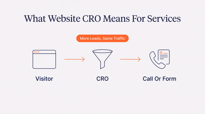
Website CRO just means getting more of the people already visiting your site to actually do something, without buying more traffic. For a service business, that something is almost never a purchase. It is a call or a filled-out form.
To calculate conversion rate, divide the number of inquiries by total visitors, then multiply by 100. Say 100 people visit and 3 reach out. That is a 3% average conversion rate. CRO is the unglamorous work of pushing that 3 up to 5 or 6 by clearing out whatever is stopping the other 97 from getting in touch.
Better website conversion rates also mean lower customer acquisition costs because you generate more leads from the existing traffic.
Why Generic Website CRO Strategies Don’t Work for Service Businesses: 4 Key Reasons

The advice itself is not wrong. It is just built for a different kind of buyer. Here are the four places it comes undone the moment you put it on a service site.
| Factor | eCommerce CRO | Service-Business CRO |
| The conversion | A completed purchase | A call or form inquiry |
| Decision speed | Minutes, one session | Days or weeks, many visits |
| Main driver | Price and product | Trust and expertise |
| Best first step | Add to cart | A low-pressure next step |
1. Different Buying Journey Than an eCommerce Website
A store wants one clean run: you browse and buy in a few minutes. Service buyers do not work like that. They poke around and compare a couple of options, then reach out days later once they have chewed it over. There is no cart to rescue, because the sale is a conversation that has not even started.
2. Longer Decision Cycles
Nobody picks a roofer or a lawyer on a whim. Days or weeks can pass between the first visit and the first message, with many visits in between. Generic conversion optimization expects the yes to happen right now, this session. Services almost never work that fast, and pushing for an instant answer just scares people off.
3. Trust Plays a Much Larger Role
Dropping $30 on a gadget is nothing. Letting someone rewire your house or handle your divorce is a whole other level of nervous. The risk is real, so people go through reviews and past work before they even type their name in. In fact, 74% of people check two or more review sites before picking a local business.
4. Customers Evaluate Expertise Before Price
In a shop, a lower price usually helps. In services, being the cheapest usually backfires because it makes people wonder what you are skimping on. They want to know you can genuinely do the job before they care what it costs. Offer a discount, and you can accidentally brand yourself the risky pick.
10 Website CRO Improvements That Have the Biggest Impact on Service Business Conversions
Alright, the actual work. These are the 10 website conversion rate optimization strategies that genuinely make the biggest difference for service sites, roughly in the order we would tackle them.
1. Clarify Your Value Proposition Within the First Few Seconds
Someone visits your site and, in about five seconds, silently asks two things: what is this and is it for me? If the answer is a meaningless slogan and a stock photo of a handshake, they are already gone. Being clear beats being clever, and honestly, most service sites are far too clever for their own good.
- State exactly what you do and who you serve above the fold.
- Replace your clever taglines with a plain sentence a stranger instantly understands.
- Name the specific problem you solve right there in your main headline.
- Swap generic stock photos for real pictures of your actual team and work.
Most businesses think a strong value proposition means inventing a clever slogan. In practice, it usually means answering a visitor’s first questions before they have time to ask them. That principle works whether you sell accounting services or brain supplements. The product changes. Human behavior does not.
A good example is this nootropic supplement brand. We know it is not a professional service, but its product pages demonstrate this trust-building sequence so well that we couldn’t resist sharing their example.
The homepage does not make people decode what the company offers. Right away, it positions the product around cognitive performance and mental clarity, then immediately backs that up by explaining what the supplement is designed to support.
The page also identifies who it is for instead of relying on vague branding, so a visitor can quickly decide whether they belong there. Only after that foundation is in place does it move into ingredients, research, and supporting information.
That is the lesson service businesses should borrow. Your visitor should not have to piece together what you do from clever headlines or abstract mission statements. Within a few seconds, they should know exactly who you help and what problem you solve. That first moment of clarity determines whether someone explores the rest of your site or clicks back to Google.
2. Reduce Decision Friction Throughout the Buying Journey
Every extra click and every question you leave hanging is one more little reason to bail. Service buyers are already jumpy about handing real money to someone for work they cannot see yet. Friction is anything that makes them pause during their user journey, and on a service site, a pause usually means they close the tab and go find whoever is easier.
- Cut any step that does not help the site visitor decide to contact you.
- Answer the obvious pricing and process questions before they have to ask.
- Strip distracting menu links and side offers off your main conversion pages.
- Make the whole visit feel effortless from arrival to contact, with no dead ends.
3. Build Trust Before Asking for Contact Information
People give up their phone number only once they believe you can help and will not waste their time. Most service sites go for the ask way too soon, before they have earned it. Trust is not displaying security badges in the footer. It is the whole page reassuring a nervous stranger that you are the real deal.
- Put social proof and named customer testimonials right beside every contact prompt on-page.
- Show your licenses and guarantees exactly where a visitor’s doubt tends to appear.
- Display recent project photos and real case results instead of vague claims.
- Add a clear, human explanation of what happens after they contact you.
This gets brutal in high-stakes services, where just reaching out feels scary. Someone facing a legal mess or a big unexpected bill is not scanning for features. They are working out whether they can trust you with something that matters. On those pages, trust is the whole ballgame, and a form too early blows it.
Family law is about as high-stakes as it gets, and this Wyoming divorce attorney page is a masterclass in earning the call. It does not lead with a form. It opens by naming exactly what is on the line – your kids and your stability – in words a frightened person actually recognizes.
Then it earns trust piece by piece. It walks you through the five stages of a divorce, so the scary unknown starts to feel manageable. It shows the real attorneys and actual case outcomes, plus reviews about someone picking up the phone on a Sunday. The ask comes last, once you already believe them.
That sequence is the lesson, whatever you sell. Calm the fear first and prove you can do the work, then ask. The scarier the decision is for your potential customer, the more of the page you should spend winning them over before that form ever shows up.
4. Match Every Landing Page to Visitor Intent
One page cannot talk to everybody at once. The person Googling emergency furnace repair at midnight needs something wildly different from someone dreaming up a kitchen remodel. Send them both to the same do-everything homepage, and you lose both.
Intent is what they came for, and matching it is what helps search engines link the page to the right searches. This helps you get more traffic to your website from the searches that matter instead of relying on one generic page to rank for everything.
- Build one dedicated page for each core service, not one do-everything page. Use Google Search Console to spot the search terms already bringing people to each page.
- Create location pages that speak to each specific area and town you serve.
- Match each page’s headline to the exact search phrase that brought them there.
- Send every digital marketing ad click to a matching page, never to your generic homepage.
The classic mistake is one service-area page that crams in forty towns, or a homepage straining to rank for all of them. It speaks to no one. Someone in a specific town wants to believe you actually work there, that you know the streets and the houses. A could-be-anywhere page tells them you probably do not.
A sharp local page fixes that by getting specific fast. Look at this page from an outdoor lighting company in Canton, Georgia. It does more than drop the town name in. It talks about Canton’s estate-style homes and big garden lots, and the kind of accent lighting those properties actually need.
It names the nearby communities it covers and answers questions specific to local homes. It also flashes an electrician license number and reviews from real Canton clients. Every piece tells a local searcher the same thing: we work right here, and we are legit.
Do that for every target audience that matters to you. Build a page that proves you get their exact situation, then aim your ads and local searches right at it. Someone who feels understood in the first line is someone who actually keeps reading.
5. Make Contact and Inquiry Forms Easier to Complete
The form is where hot leads go cold on most service sites. You finally talked someone into reaching out, and then you hit them with 14 fields and a CAPTCHA that fails twice. Every box you add is another excuse to give up. A form should be a quick hello, not a tax return.
The numbers back it up. Trimming a form from 7 fields down to 3 can boost conversions by 20 to 35%, which for a busy service site is real money either way.
- Ask only for the few fields you genuinely need to respond to them.
- Cut the required company-name field and any nosy budget or referral dropdowns.
- Offer a call or a short form, so people pick their own way.
- Replace broken CAPTCHAs with a simpler spam check that never blocks real people.
6. Create Calls-to-Action That Reflect Buyer Readiness
Most service sites use the same Contact Us button on every page. But someone who just showed up is nowhere near ready to book a consultation with a stranger. Buyer readiness is basically how far along someone is between just curious and ready to commit, and one pushy button ignores everyone who is not there yet.
- Offer a low-commitment step, like a pricing guide, to encourage visitors.
- Reserve the strong book-a-call button only for your highest-intent service pages.
- Match each CTA to the visitor’s stage and desired action, not to your own sales goal.
- Give hesitant visitors more value without having to commit to anything.
7. Remove Technical Friction That Interrupts Conversions
You can get every word right and still lose people to a slow load or a mobile layout that breaks. Technical friction has nothing to do with your pitch and everything to do with whether the site works. On a phone, where most service searches happen now, mobile optimization is not optional because a sluggish page is a killer. People do not wait; they leave.
And it is measurable. Every extra second of load time reduces conversions by roughly 7%, so page speed is a real conversion driver, not just an SEO thing. On WordPress, a plugin like WP Fastest Cache handles the hard part – page caching and image optimization – turning weak Core Web Vitals into one of the quicker fixes here.
- Open your own site on a real phone over a slow mobile connection.
- Compress heavy images and turn on caching to cut load time noticeably.
- Fix any form field or button that breaks on smaller mobile screens today.
- Run a full speed test, then apply the quick performance tweaks it flags.
8. Use Behavioral Data Instead of Assumptions
Most site changes are based on what the owner reckons visitors want, which is usually miles off. You are not your customer. Website analytics tell you what visitors did, not what you think they did. Analyzing user behavior beats redesigning based on opinions.
Qualitative data lets you do a simple conversion funnel analysis: where they scroll and where they quit. Guessing feels quicker, but it is exactly how sites end up looking slick and still converting nobody.
- Add a heatmap tool to see where visitor attention actually goes on-page.
- Watch a batch of session recordings to find where users drop.
- Use conversion rate optimization tools + collect user feedback to track which specific web pages and forms are losing you the most website visitors.
- Check Google Analytics and base each change on real visitor behavior you can observe, never a hunch.
9. Test Changes Systematically Instead of Redesigning Everything
When conversions are low, the urge is to nuke the whole site and start fresh. That mostly just swaps a set of problems you knew about for a set you do not, with zero clue what actually helped. Testing systematically means changing one thing, watching what it does, then keeping it or binning it. Slower optimization efforts, but you actually learn something.
- Change one element at a time so you know what actually worked.
- Give every test enough time and real traffic to reach honest results.
- Keep a simple written log of every change you make and when.
- Roll back any change that does not clearly and measurably improve conversions.
10. Optimize for Lead Quality Instead of Conversion Volume
More leads sounds great until you are overwhelmed by the wrong ones. More of the right leads is the goal. Fifty tire-kickers hunting a free quote are worse than five serious buyers, because your team torches hours chasing people who will never hire you. Lead quality means pulling in who you want and waving off who you do not.
- Speak directly to your ideal higher-value client all through your page copy.
- State your pricing range or minimums to filter out poor-fit inquiries early.
- Ask one smart qualifying question on the web form to sort your incoming leads.
- Use success metrics to track how many leads actually become clients, not just raw form submissions.
This matters most when you serve two very different customers from one site. A company doing both small residential jobs and big commercial contracts cannot target both at once. Lead with residential, and you have small jobs, while the commercial buyer assumes you are not built for their scale. The mismatch costs you the leads you most want.
Look at how this focused page by a commercial HVAC service provider in Suwanee, GA fixes that split. Instead of categorizing commercial work under residential, it gets its own page that speaks the commercial buyer’s language from the first line, about employee comfort and operating budgets.
It proves scale with specifics. It lists work like building-management systems and full-facility zoning, then shows NATE certification and fifty years on commercial jobs. A facilities manager sees that and instantly thinks these people handle buildings my size. The page has pre-qualified the lead before anyone touches the form.
That is the real payoff: fewer junk inquiries, and more leads actually worth your time. And time is exactly the point, because a small service team only has so many hours in a day. Getting honest about where those hours actually go is what makes the case for quality over sheer volume.
Conclusion
If you remember one thing, make it this. Stop copying website CRO tricks built for online stores. Your visitors are not shoppers loading a cart. They are cautious people deciding whether they can trust you with something that matters. Talk to that caution and clear the friction, and your site’s conversion rate goes up. Most of this is common sense your competitors ignore.
We make WP Fastest Cache because speed is the one key element almost any WordPress site can ship this week. It takes care of page caching and image optimization for over 1.5 million sites, no developer needed, so your pages show up before a visitor loses patience. Get started now.