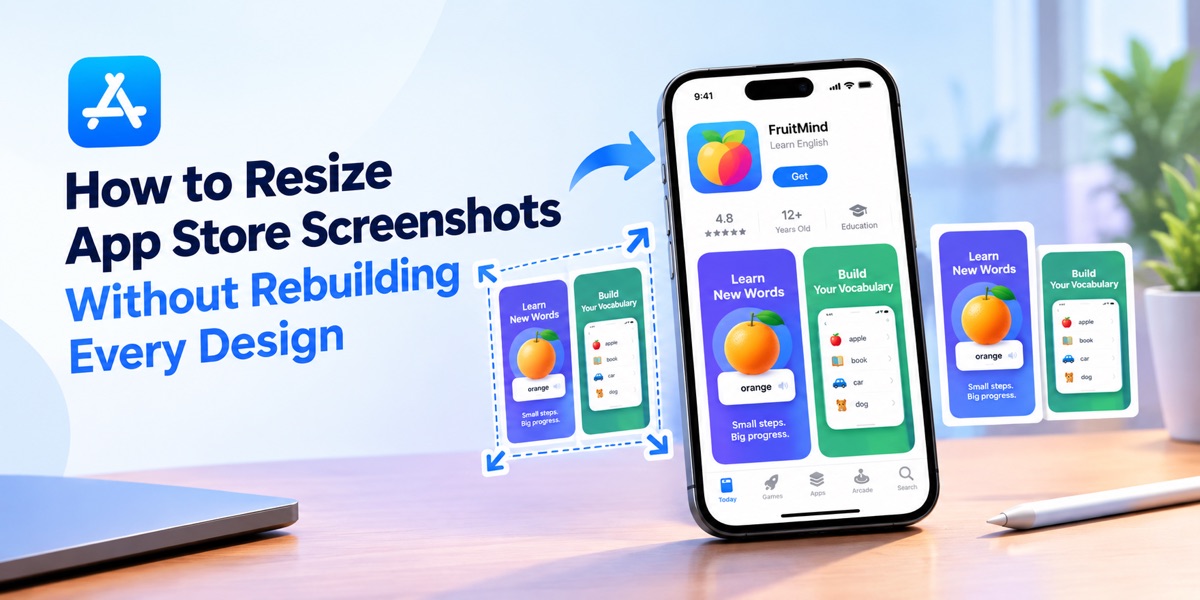
How to Resize App Store Screenshots Without Rebuilding Every Design

Resizing App Store screenshots sounds like a simple export task until a polished design has to work across several devices.
A headline that feels perfectly balanced on an iPhone can suddenly wrap awkwardly on an iPad. A phone frame may dominate a smaller layout. Supporting copy can become difficult to read, while a composition that originally felt premium starts to look compressed.
The problem is not simply pixel dimensions.
A strong screenshot has a hierarchy, a message and a visual rhythm. Resizing works best when all three survive the move to another format.
Resizing Is a Layout Problem, Not Just a Pixel Problem
A finished screenshot contains several layers working together: the real product interface, a headline, supporting copy, device framing, backgrounds and spacing.
Changing only the canvas dimensions can upset that balance.
A taller format may need more breathing room around the device. A tablet composition may benefit from a wider interface crop. Apple Watch assets require an entirely different visual hierarchy because there is far less space available.
The goal should not be to make every layout identical.
The goal is to make every format feel as though it was deliberately designed for that screen.
Start With the Message Before the Dimensions
Before adapting a screenshot, decide what that image is supposed to communicate.
One screen may introduce the app’s central promise. Another might demonstrate the main workflow. Later screens can focus on personalization, speed, collaboration or another supporting benefit.
Once that purpose is clear, resizing becomes easier because the designer knows what must survive.
The headline needs to remain readable.
The interface needs enough scale to feel useful.
The focal point should remain obvious.
Everything else can adapt around those priorities.
Build One Visual System That Can Adapt
This is where screenshot production becomes much easier when the entire campaign is treated as one system rather than a collection of unrelated files.
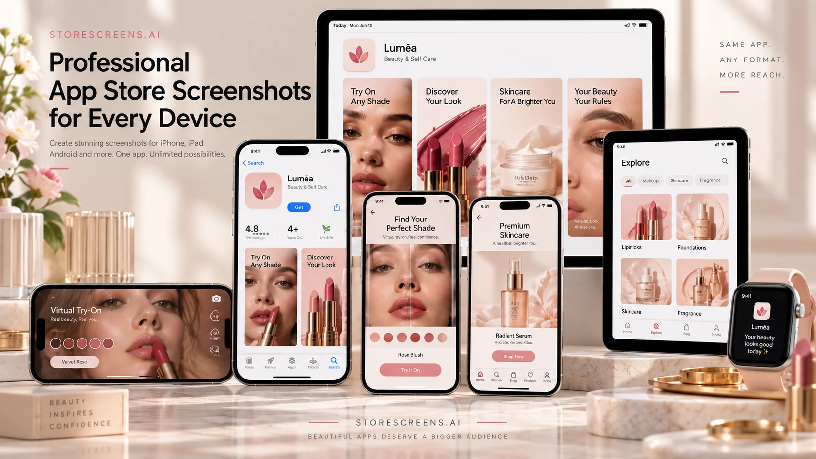
For teams that want to move from a short app brief and real product screens to a coordinated launch presentation, StoreScreens.ai brings the workflow together across App Store and Google Play formats.
Instead of starting with an empty template, teams can describe the app, use their own screenshots as references and develop a screenshot story around the real product. StoreScreens can shape the visual direction, create benefit-led headlines and carry that system across different device formats.
The result is not simply the same picture resized several times. The composition can remain visually connected while allowing each screen to fit the format it was created for. StoreScreens also supports localization across 40 languages and lets individual screens be regenerated without rebuilding the entire set.

Keep the Hierarchy Stable
The device may change, but the order in which someone understands the screenshot should remain clear.
A strong hierarchy might be:
the benefit first,
the product interface second,
supporting detail third.
That structure can survive even when the exact placement changes dramatically between a phone, tablet and watch.
Let the Composition Move
Responsive store design is not about shrinking everything proportionally.
Sometimes the phone needs to move lower.
Sometimes a headline should sit beside the product instead of above it.
A large tablet may allow more of the real interface to remain visible.
The creative system should be flexible enough to make those decisions without losing its identity.
Use a Workflow Built for Store Formats
Manual resizing becomes increasingly repetitive once an app supports multiple devices, languages and product updates.
A purpose-built App Store screenshot generator can handle that workflow from the beginning rather than forcing one finished canvas into every destination.
StoreScreens currently produces dedicated App Store sets for iPhone, iPad and Apple Watch, with exports at 1290 × 2796 px for iPhone, 2064 × 2752 px for iPad and 410 × 502 px for Apple Watch. The same project can also extend into Android formats instead of requiring a completely separate visual campaign.
That matters because the final goal is not simply a technically accepted file.
The screenshot still needs to look intentional after export.
Localization Changes the Layout Too
Another common resizing problem appears when screenshots are translated.
A headline that occupies one line in English may require two or three lines in another language. Characters can become wider, spacing changes and text can begin competing with the product interface.
That is why localized screenshots should be treated as design variants rather than simple text replacements.
A flexible visual system leaves enough room for copy to expand while protecting the main hierarchy.
Make Future Updates Easier
Store screenshots are rarely permanent.
A redesigned interface, new feature, additional market or new device can create another round of production work.
Building the screenshot campaign as an adaptable system makes those updates much less disruptive.
Instead of reconstructing everything from old exports, teams can return to the visual direction, update the relevant screen and preserve the rest of the campaign.
That approach is especially useful when the product itself changes faster than the marketing assets around it.
Check the Design Before the Final Export
Before uploading the finished assets, review the entire screenshot set together rather than checking each image in isolation.
Look at headline size, device scale, spacing and visual consistency.
Make sure important interface details remain readable and that no format feels like a compromised version of another.
The strongest screenshot systems feel unified without forcing every device into the same composition.
Resizing then stops being an exercise in making something fit.
It becomes a way to preserve the same product story wherever the app appears.