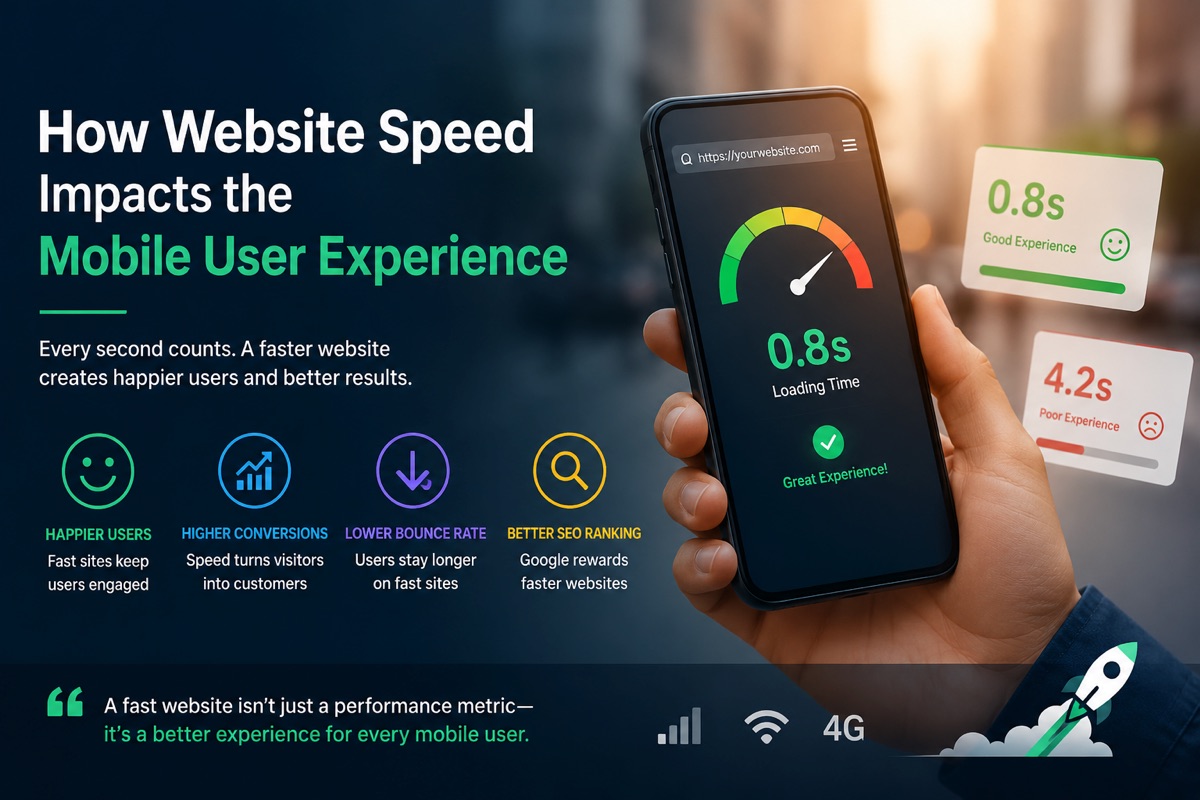
How Website Speed Impacts the Mobile User Experience

Picture this: you’re on your phone, trying to check a store’s hours or buy something before a meeting. The signal is weak. The page shows a blank screen, then half an image, then a button jumps from under your thumb. Annoying, right?
Website speed isn’t only about convenience. It affects trust, engagement, accessibility, sales, and how easily people find your site through search. On mobile, where attention is already thin, a slow page can lose someone before your message even appears.
Here’s what slow performance does to users, which signals matter, and where to start fixing the friction.
How Website Speed Shapes the Mobile User Experience
Mobile browsing happens in messy conditions. People are standing in line, riding public transit, waiting for appointments, or comparing products with one hand free. They may have a budget phone, a nearly full storage drive, or a spotty cellular connection.
Someone browsing on a phone like the Jitterbug Smart5 may experience a slow, overloaded website differently from someone using the latest flagship device.
That changes the stakes. A desktop user might tolerate a page that hesitates for a moment. A mobile visitor often has another tab, another app, or another business one search result away.
Speed also affects how a site feels. Quick pages feel cared for. Slow pages feel unreliable, even when the product or service is excellent. No fixed load time guarantees success, of course. A useful page with a clear answer can still hold attention. But every unnecessary pause makes that harder.
Slow pages increase frustration, errors, and bounce rates
A slow page doesn’t always look slow at first. Sometimes it shows a blank screen. Other times, the text appears but buttons don’t respond. A shopper taps “Add to Cart,” nothing happens, and they tap again. Now there are two items in the cart. Not ideal.
Layout shifts make things worse. A banner loads late and pushes the page down, and the user taps the wrong link. On a checkout page, that small jump can feel like the site is fighting them.
People respond in predictable ways:
- They refresh the page.
- They leave and pick another result.
- They abandon forms and carts.
- They assume the business is outdated or unsafe (or both)
Ultimately, research shows 53% of users abandon mobile sites that take over 3 seconds to load.
The Relevant Mobile Performance Signals
A score can point you in the right direction, but it isn’t the whole story. Mobile performance needs both controlled tests and data from real visitors.
Google’s Core Web Vitals focus on three parts of the experience: loading, responsiveness, and visual stability. Their commonly used “good” targets are measured at the 75th percentile of page visits.
| Metric | What it measures | Good target |
| Largest Contentful Paint (LCP) | Main content loading | 2.5 seconds or less |
| Interaction to Next Paint (INP) | Response after an interaction | Under 200 milliseconds |
| Cumulative Layout Shift (CLS) | Unexpected page movement | Below 0.1 |
These are useful goals, not a complete verdict on a website.
What LCP, INP, and CLS reveal about a phone user’s experience
Largest Contentful Paint, or LCP, tracks when the largest visible element appears. On a product page, that may be the main product image, heading, or price area. If it takes too long, users are left staring at an unfinished page.
Interaction to Next Paint, or INP, measures how quickly the page responds after a tap, click, or key press. It catches the awkward delay after opening a menu, typing in a search box, or applying a filter.
Cumulative Layout Shift, or CLS, tracks unexpected movement on screen. If a late-loading ad pushes a “Buy Now” button away as someone reaches for it, CLS is part of the problem.
Why real-world mobile conditions change performance results
Lab tests use controlled conditions. They are great for spotting large images, blocking scripts, and other technical problems. Real-user data shows what visitors actually experienced across many devices and connections.
Phone age, processor speed, browser version, screen size, location, connection quality, and data-saving settings can all change the result. A developer’s new phone on fast Wi-Fi is not the average visit.
Google PageSpeed Insights combines lab information with field data when enough data exists. Chrome Lighthouse is useful for repeatable tests during development.
Practical Ways to Make a Website Faster on Mobile
Start with measurement, then fix the biggest bottleneck and test again. Trying to fix everything at once creates busywork and can introduce new bugs.
The best improvements protect content quality, accessibility, security, usability, and good UX design. A page shouldn’t become faster by removing the information people came to find.
Optimize images, fonts, and above-the-fold content
Images are often the heaviest files on a mobile page. Serve images at the size they will display, rather than sending a huge desktop file to a small screen. WebP and AVIF can reduce file sizes when browser support fits your audience.
Reduce code and third-party scripts that slow interactions
Large JavaScript bundles can delay rendering and make taps feel sluggish. Unused CSS adds work too. So do trackers, chat widgets, pop-ups, social feeds, and tools added one at a time over years.
Remove scripts that don’t support a clear user or business goal.