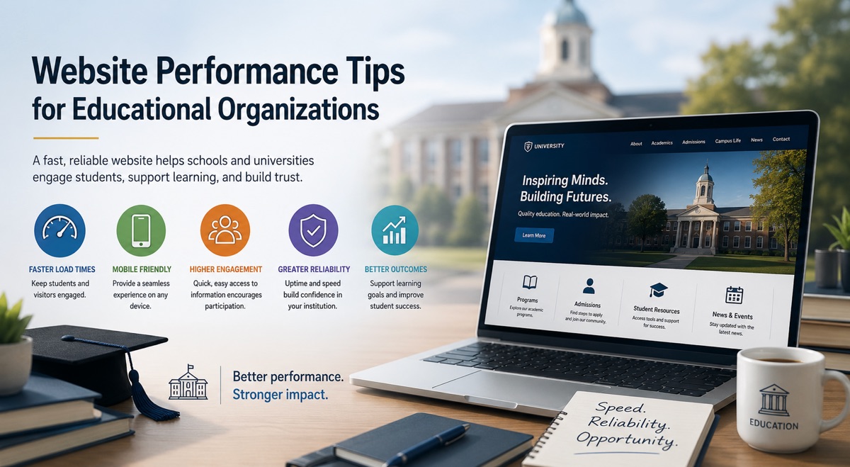
Website Performance Tips for Educational Organizations

Parents, students, and staff all have one thing in common: they expect your website to work quickly and without drama. When your pages stall, freeze, or take ages to load, you lose trust, applications, and opportunities.
A fast, clean site makes your school or organization look organized, modern, and welcoming before anyone ever steps on campus. Savvas, the learning solution trusted by schools and districts, shows how the right digital tools can make your website feel simpler, faster, and more welcoming for every visitor.
Below is a practical guide you can use right away to make sure your website supports enrollment instead of silently sabotaging it.
Why Slow Websites Quietly Kill Applications
Picture a parent trying to submit an application form on their phone while rushing between work and home. They’re checking deadlines and requirements on your site and get stuck on a spinning loading icon. They wait, reload, and finally give up.
This happens more often than most organizations realize. Long load times, broken forms, and heavy pages directly reduce completed applications and inquiries. Slow pages increase bounce rate, which means people leave before they even see your offer.
Search engines notice this behavior as well. When visitors leave quickly, your pages can slip down in search results over time. A fast website keeps people on the page longer, helps them explore more content, and tells both visitors and search engines that your organization is trustworthy and well run.
Key Performance Tips for High-Traffic Periods
Application season, exam results, and registration weeks can push your website to its limits. This is when you find out whether your site is ready or not. The goal is to keep your crucial pages fast and stable, even when the traffic spikes.
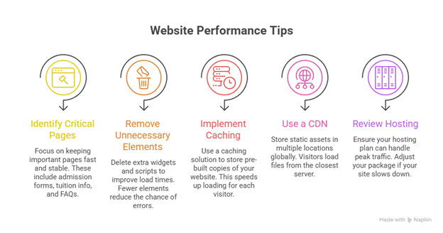
Start by identifying “mission-critical” pages like admission and application forms, tuition and fee info, scholarship and financial aid pages, program or course descriptions, and FAQs.
Remove extra widgets and excessive scripts. They confuse visitors. Fewer elements on the page mean faster load times and fewer things that can break under pressure.
Caching is another easy win. A caching solution is a ready-made copy of your website for every visitor. Your server doesn’t have to rebuild the page from scratch for every visitor anymore.
A content delivery network stores copies of your static assets (images, scripts, styles) in multiple locations around the globe. Visitors load those files from a server that is physically closer to them. It cuts down the time it takes for your pages to appear on their screens.
Finally, look at your hosting. If your site slows to a crawl every time you send a newsletter or publish new results, you may have outgrown your current plan. Work with your provider to understand your traffic patterns and make sure your package can handle peak usage.
Forms, Fees, and Frustration: Fixing the Enrollment Experience
From the visitor’s perspective, enrollment is a simple sequence: find information, decide, fill out forms, pay fees, and receive confirmation. Each step depends on the website working smoothly.
Start with your forms. Test every form like a new visitor would:
- Try various browsers.
- Use a mobile device, not just a desktop.
- Make intentional mistakes to see how error messages appear.
Keep forms short. Ask only for information you truly need. Fee pages should be quick to load, clear in the amounts shown, and offer a simple process. Use known payment gateways and other security cues to make people feel safe using them. Each extra step is another chance for confusion or a failed transaction.
Content and Design That Support Fast Enrollment
Speed is not just a technical issue. What you show on the page (and how you show it) can make your site feel much faster and easier to use. Clear design and focused content are part of performance.
Look at your admissions pages. Are they cluttered with long paragraphs, multiple banners, and outdated announcements? Guide visitors with short sections, headings, and bullet points.
Calls to action with button text like “Apply now,” “Start your application” or “Request more information” are evident and friendly. Place these buttons in easy-to-see places on the page.
Images and videos are powerful. They can also slow pages down if they’re too large or poorly compressed. With optimized media files, you avoid loading full-resolution photos when a smaller size will do.
Add alt text to images, use readable fonts, and maintain good contrast for accessibility. Use simple navigation menus with clear categories (Programs, Admissions, Tuition and Aid, and Contact). Too many menu items or lists are confusing.

These changes help more people use your site comfortably and signal that your organization cares about every visitor’s experience.
Keeping Your Site Fast All Year
Treat performance as regular maintenance, like checking fire alarms or updating student records.
Set a simple schedule of monthly performance checks, regular software updates for content management systems, themes, and plugins, and backups before major content changes or campaigns.
The end result is simple but powerful: a fast, friendly website that makes enrolling in your organization feel easy.